

Artist’s Palette: Rhiannon Piper
An artist's palette is pivotal in defining their visual expression and style. This article dissects the curated palette of myself, Rhiannon Piper, detailing the historical context of each chosen pigment and their specific utility in my work. While it's true that palettes are ever-evolving, and I must admit a penchant for experimentation, the majority of my colour choices have remained consistent over the last three years. The exception to this stability is a recent addition, which I will detail later. This exploration is the first in a potential series where I aim to examine the palettes of various artists and how these selections resonate with their artistic output.

My very messy and in-use palette.
The Palette:
Below is a comprehensive list of all the paints I utilize in my work. I intentionally limit my palette to enhance cohesion within my artistic expression. While I occasionally reach for additional colours in a pinch, I predominantly strive to create the necessary hues from these specific pigments. This approach not only streamlines my process but also deepens my understanding and manipulation of these colours to achieve desired effects.
Burnt Sienna: Originating as a natural earth pigment, it undergoes a heating process to transform from yellowish-brown to a robust rust colour. This pigment is integral for creating diverse skin tones, adding natural warmth when mixed with whites or yellows.
Burnt Umber & Raw Umber: Earth pigments rich in iron oxide and manganese, with Burnt Umber being a heated, darker variant of Raw Umber. This pigment is useful for modeling and shading in skin tones, with Burnt Umber providing warmer tones and Raw Umber cooler, more subdued hues.
Caput Mortuum: A byproduct of alchemy, this pigment offers a range from deep violet to reddish-brown. Used for deepening the darker tones in flesh and recently for achieving more vivid lip colours, especially in combination with Quinacridone Magenta.
English Red Earth: A traditional reddish-brown pigment used since ancient times, similar to Terra di Siena. Enhances the red elements in skin tones and adds a natural, earthen quality to landscapes.
Ivory Black: Originally produced from charred animal bones, it is a deep, cool-toned black. Employed for creating the deepest shadows and adding contrast in compositions. (I disagree with the rule taught in school not to use black straight from the tube - I use it alot. Avoid using it to darken anything or it’ll become muddy and grey).
Naples Yellow Pale: Historically made from lead antimoniate; modern versions are non-toxic. It is believe to have gotten its name from the other yellowish minerals found on Mount Vesuvius. It is known for its light, opaque yellow. Essential for achieving variations in light skin tones and enhancing the luminosity in sunlit scenes.
Prussian Blue: The first modern synthetic pigment, discovered accidentally in the early 1700s, known for its deep blue shade. Used sparingly to add depth and darkness to shadows, effective in creating complex greens and grays.
Quinacridone Magenta: A synthetic pigment developed in the 1950s, celebrated for its brilliant violet-red hue and high lightfastness. Adds vibrant, cool red tones to compositions, enhancing lip colours and floral elements.
Raw Sienna: A naturally occurring lighter variant of Burnt Sienna, it is a yellowish-brown iron oxide pigment. Adds subtle, earthy qualities to skin tones and landscapes.
Titanium White: Titanium White, made from titanium dioxide, was introduced as a brighter, safer alternative to lead white. Critical for lightening other colours and adding highlights.
Unbleached Titanium White: Unbleached Titanium White offers a creamier, more natural cool variant. It provides a unique grayish colour for nuanced shading in the skin and a perfect colour for backgrounds.
As mentioned in the introduction, there is a recent addition to my palette which happens to be the above mentioned quinacridone magenta. Initially introduced to my palette through a kindly gifted tube, I have found it invaluable for achieving the delicate, flushed tones in skin areas, bringing a new dimension to my portraits. Its use has allowed for more vivid, lifelike representations, particularly in capturing subtle nuances of warmth and vitality. Given the uniqueness of Quinacridone Magenta and its vibrant hue, I am considering its place in my future work. Like Prussian Blue, another pigment I use in tube form due to its cost, Quinacridone Magenta is expensive, particularly when sourced as a raw pigment. Thus, if I decide to continue incorporating this colour, I would likely purchase it in tube form to manage costs while still benefiting from its rich, dynamic qualities.
Why This Palette Works
The carefully selected palette I use is particularly well-suited for my primary focus on self-portraits, where the necessity for excessively vibrant hues is minimal. This limited palette not only streamlines my creative process but also enhances the cohesiveness and depth of my work.
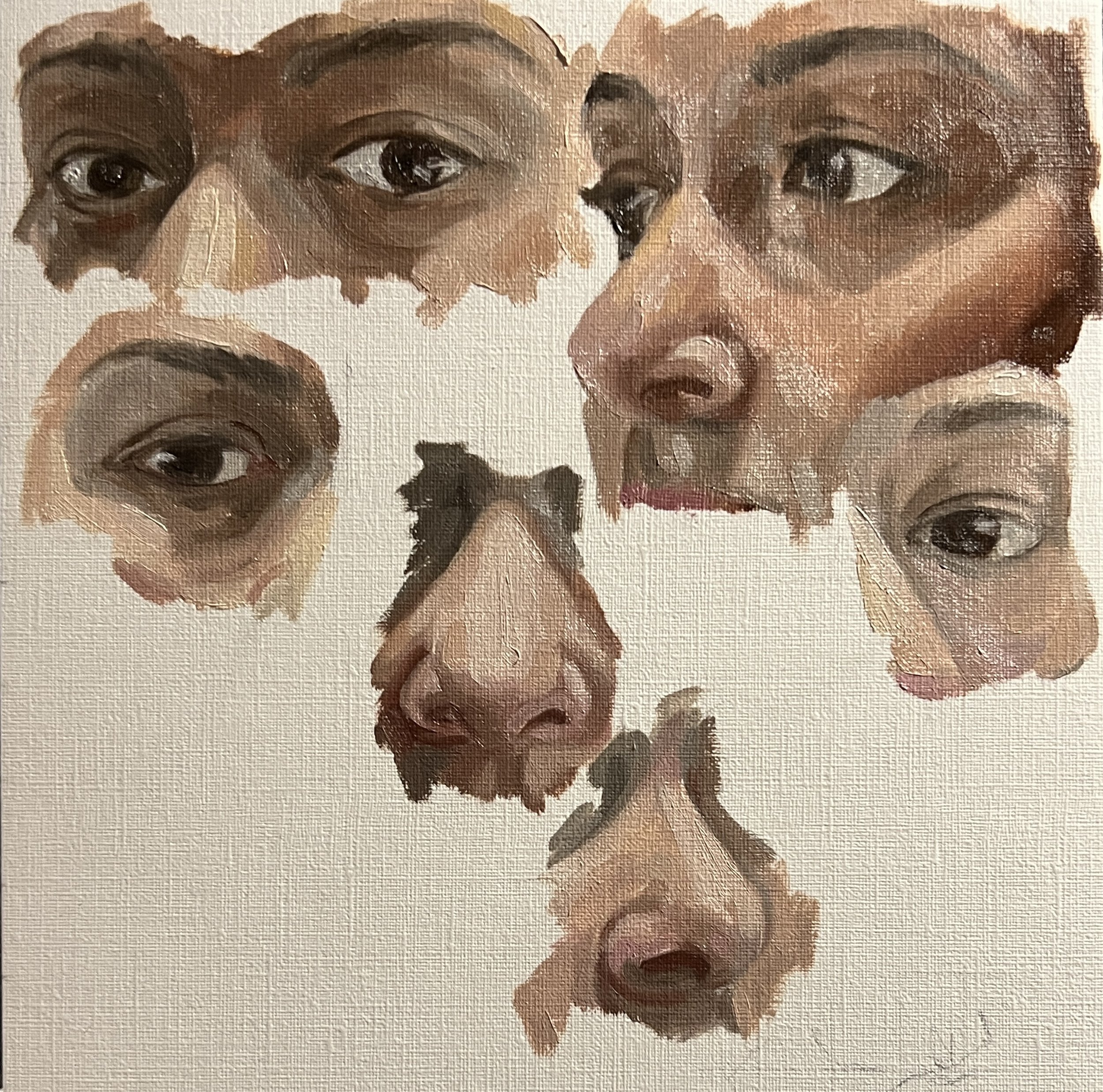
The studies from which the above palette was used to create.
By using a restricted range of colours, I achieve a consistent tonality and mood across my paintings, which is crucial for the intimate, introspective nature of self-portraiture. The subtle variations and interplay of earth tones like Burnt Sienna, Umber, and Naples Yellow, along with strategic uses of Titanium White and the deeper tones of Caput Mortuum or Prussian Blue, allow for a complex, nuanced rendering of flesh and the myriad expressions it can convey.
Previous Palette
The evolution of my palette has been informed by both technical considerations and personal preferences. Initially, my palette included colours such as Ultramarine Blue, Cobalt Yellow, Cadmium Yellow, and Pthalo Green. However, these were gradually phased out due to various challenges and artistic demands. For instance, Pthalo Green, while visually striking, proved problematic with its overpowering tinting strength and propensity to stain, making it exceedingly difficult to control.
My dissertation research on cadmium further influenced my decision to eliminate Cadmium Yellow from my palette. The purported instability of the yellow pigment and health concerns associated with handling raw cadmium pigments led to its removal, prioritizing both my safety and the long-term stability of my artworks. Ultramarine Blue was replaced by Prussian Blue, which I found to be more versatile for my needs; the switch was also driven by the redundancy of having two similar blues, with Prussian Blue fitting more seamlessly into my colour schemes.
Mars Brown and Black were experimented with but ultimately discarded. Both pigments tended to produce flat, somewhat uninspiring effects that did not align with the dynamic and expressive quality I aim for in my work. These adjustments have not only refined the technical aspects of my painting but also enhanced the overall expressive power and coherence of my artistic output.
In conclusion, the palette I have detailed here represents my current selection, perfectly suited to my artistic needs and the specific demands of my work in self-portraiture. However, as with any creative process, the possibility of change is inherent. My palette is likely to evolve as I continue to explore new techniques, pigments, and respond to the changing dynamics of my artistic expression. I anticipate revisiting and possibly revising this palette as my work grows and shifts over time. Perhaps next year, I will write an updated version of this article to share any changes and insights from further experimentation and research.